
Crowdkast
UX Design, UI Design
People are consuming media content like never before. This is happening while we are driving, exercising, working, doing our morning routine, you name it. We saw an opportunity to fructify a space that has been given little attention in the past but has been growing tremendously since sever years now, crowdsourced audio content.
There is so much content online where people can turn to (Youtube, Insight Timer, Audible etc) but the problem with it is that it's not tailored for the needs of this niche market. We took this opportunity to design an easy to use experience that is not only what listeners have been looking for but also fun to use.

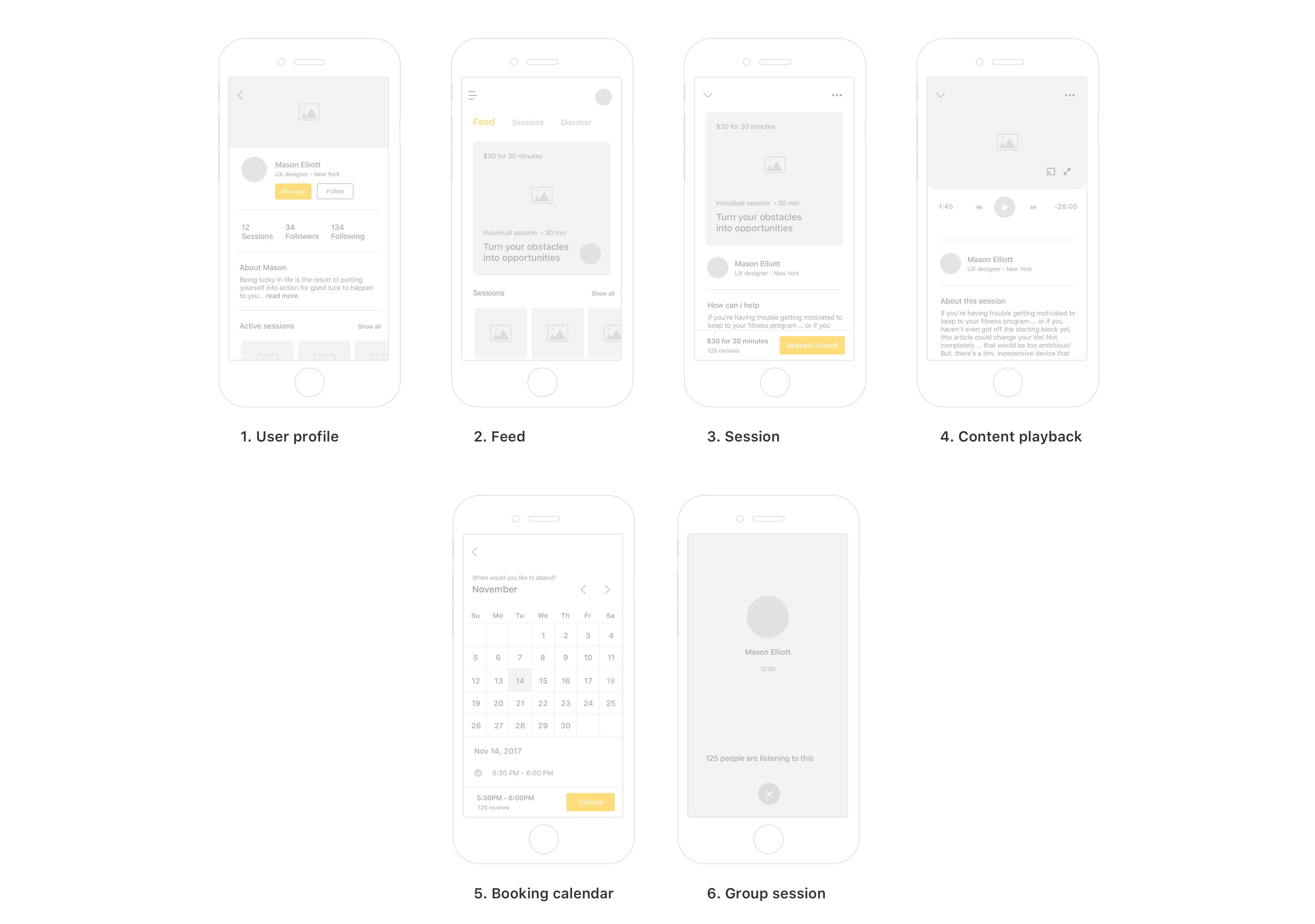
Wireframes
We discovered that the people we were designing the product for were mainly looking for 2 things, easily navigate the app to find quality content and the second thing was short playback time, up to 30 minutes.
The challenge was that we needed to create an experience where they could easily discover new content and navigate throughout the app. Therefore we decided that the user should never need to tap more than 3 time to get to any content listed on the app, and the way they interact with the app should feel as if they are not leaving the homepage. Easily said than done 

An explosion of colors
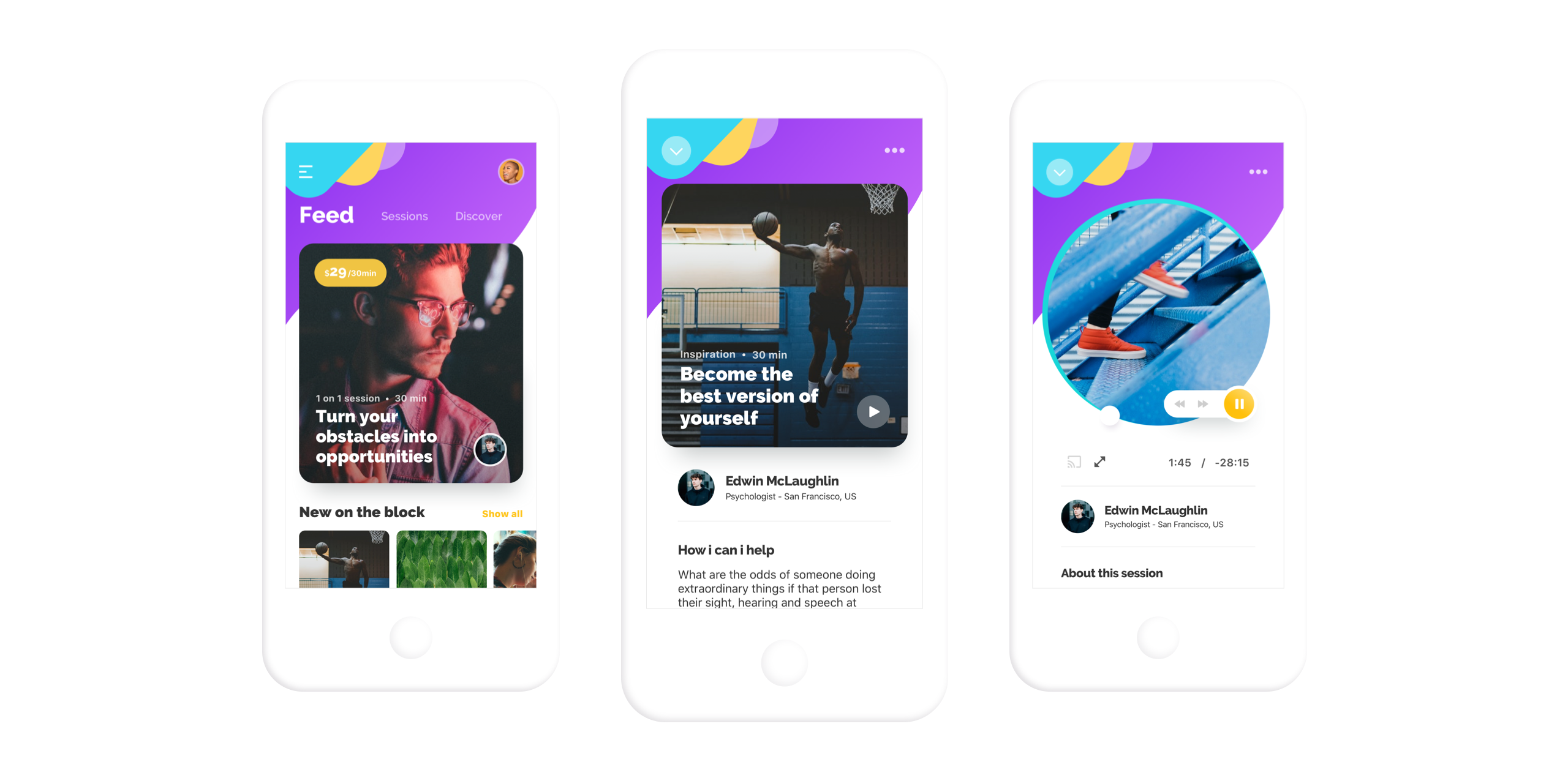
The overall design speaks for itself and it's orientated towards the niche market it's targeting, specifically millennials. We wanted the users to feel as if they are somewhere special, far away from their usual apps. We wanted them to own the design and feel as they have something that no one else has.
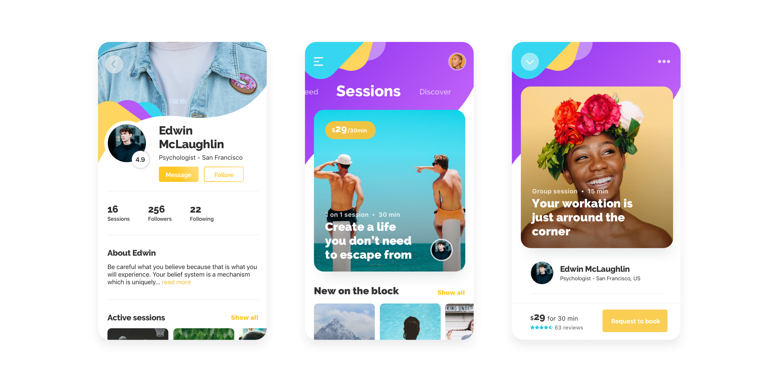

The palette combines a range of playful colors that go hand in hand with the overall dynamic layout, giving the impression that the design is just floating below your finger tips. Colors are mainly used to emphasize action, state and create a harmonious consistency throughout the app.


Redefining the content player
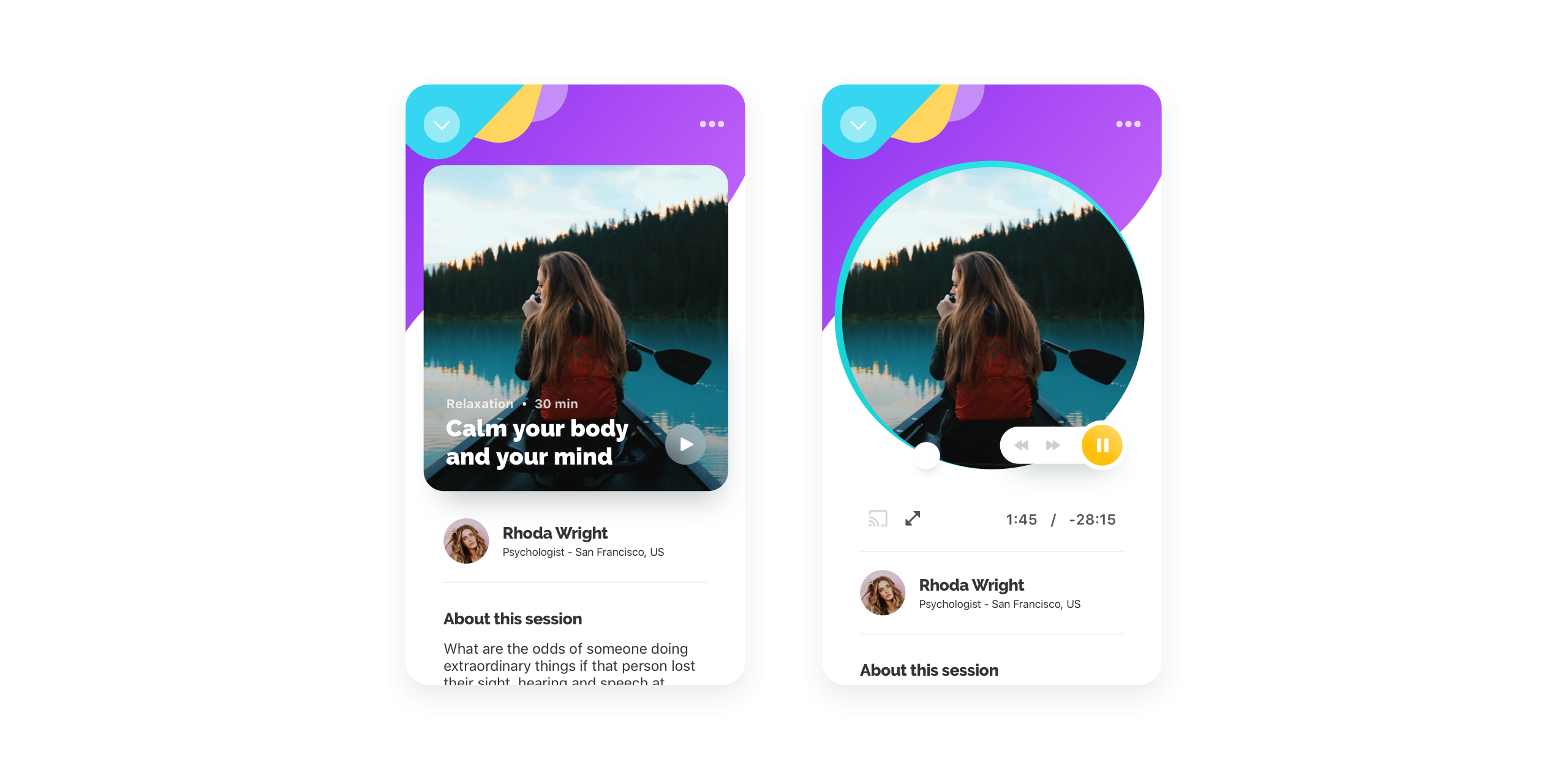
One of the challenges that we had while designing the app was figuring out a way to design a user experience in which the user feels that everything happens on one page. We knew from start we had to build everything around micro-animations and also go beyond and try to make people interact with the content player in a different way while at the same time improving it's efficiency. Having the slider on a semi-circular track gives the user a better control of the content.

Attend live sessions
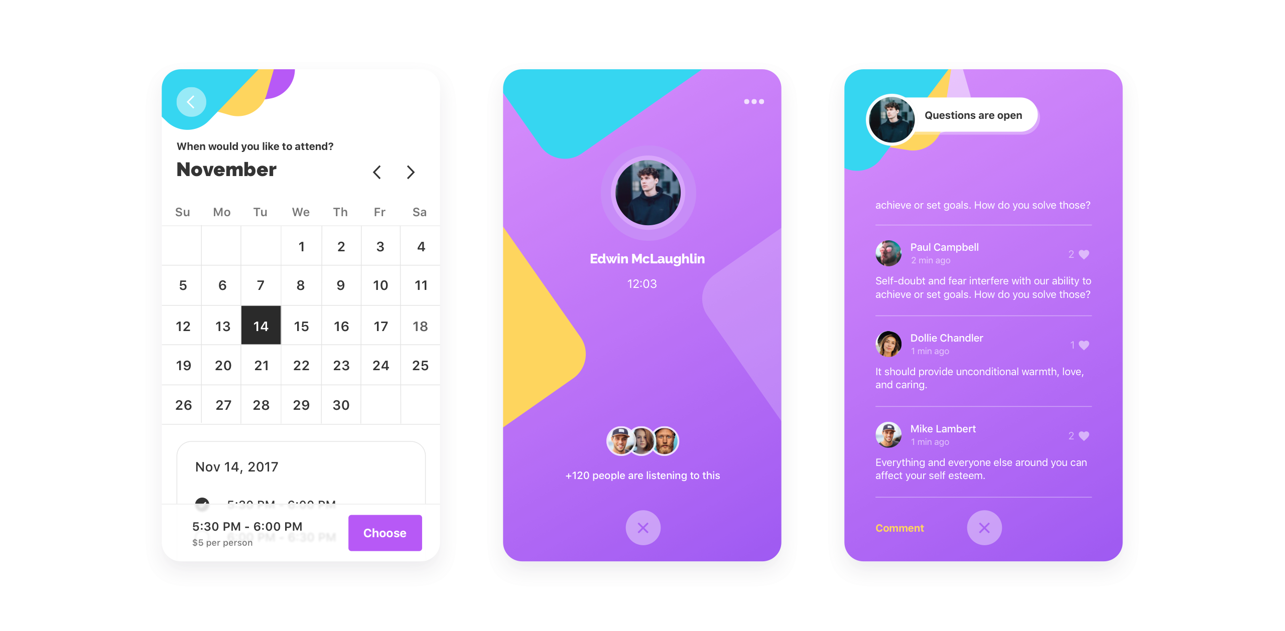
One of the unique features of the app is the possibility to attend scheduled live group sessions or 1 on 1 sessions with content creators, namely session creators. These sessions can range from mindfulness to personal growth sessions and beyond. This is an interesting feature that not only makes the whole experience more personal but also is a good revenue stream for the session creators and a monetization strategy for the app.

Naturally designed micro-animations
In order to allow the users to easily navigate where they want and feel as if they are always in the same place, designing the whole experience around fast and efficient micro-interactions was the way to go. The app features smooth transitions that feel natural and intuitive.
Final result
Getting all the little details right is critical to having a clean and simple design. This means going through a number of different iterations and testing before landing the best solution.


