


InstaDApp Redesign
UX Design, UI Design
InstaDApp is a decentralized application that allows individuals to track their distributed blockchain assets over a range of products and move them around based on real-time market data.
If you are not familiar with what a decentralized application (dApp) is, it’s a digital application or program that exist and runs on a blockchain or P2P network of computers instead of a single computer. In the context of cryptocurrencies, dApps exist and run on a blockchain network in a public, open-source, decentralized environment and are free from control and interference from any single authority, unlike standard apps such as Airbnb or Uber that run on a system which is owned and operated by an organization giving it full authority over the app and its database.


Hover over left or right to see the changes
The Challenge
InstaDApp is a fairly new product and even though the overall product brings value to users, we‘ve spotted some UX issues that are undermining the user experience for power users.
Our main goal was coming up with solutions to these UX issues while giving the product a new, more minimalistic approach and making the interface easier to navigate through while delighting users with a beautiful and pleasant experience.
We focused on solving the following issues having in mind the flow of a power user:
- Improving the overall UI since the current one has a lot of cognitive loads and reshaping the Compound protocol to make fit properly within the InstaDapp environment.
- Remove friction from the trading feature making it easier and faster for users to trade their assets. (We are going to call this feature trade instead of swap as our research shows it’s much easier for new users to understand this).
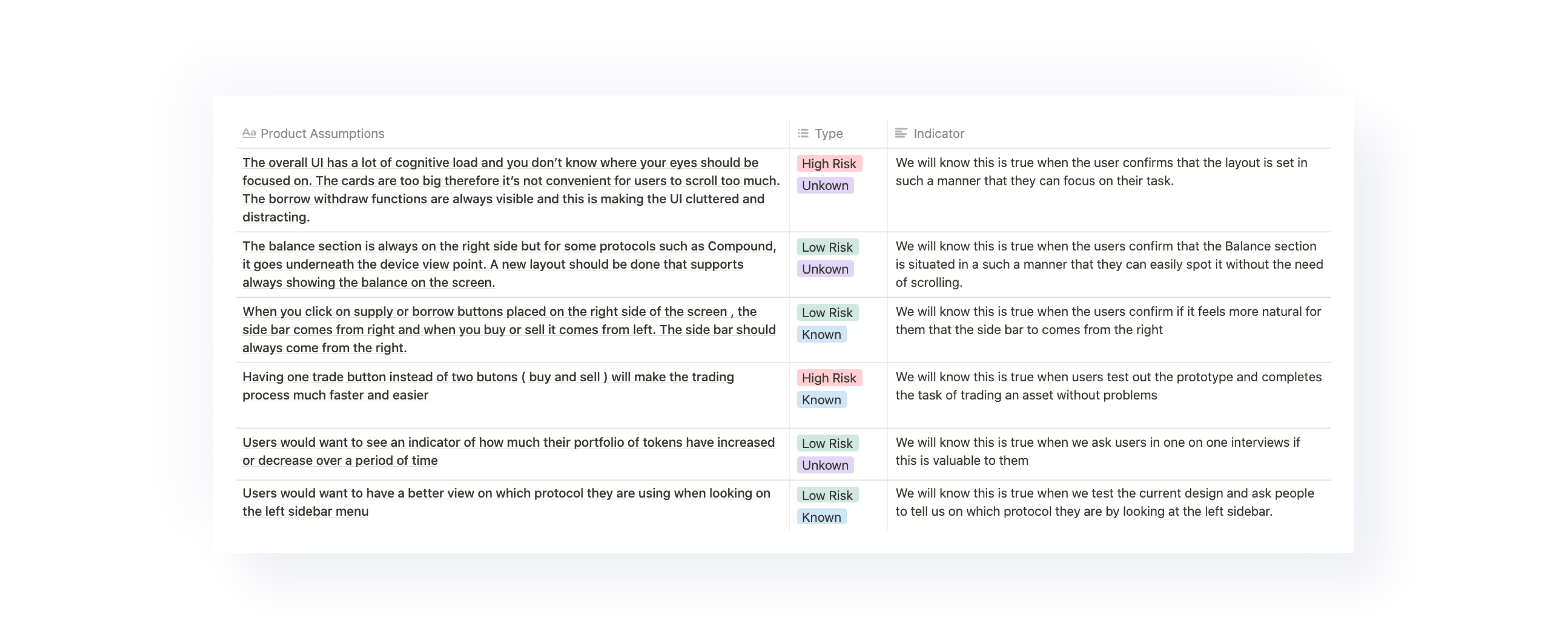
Setting out hypothesis
Before opening any design tool, we started setting out assumptions based on the UX and UI issues we’ve found. These assumptions were validated later in a few user testing sessions we ran with power users.

Wireframes
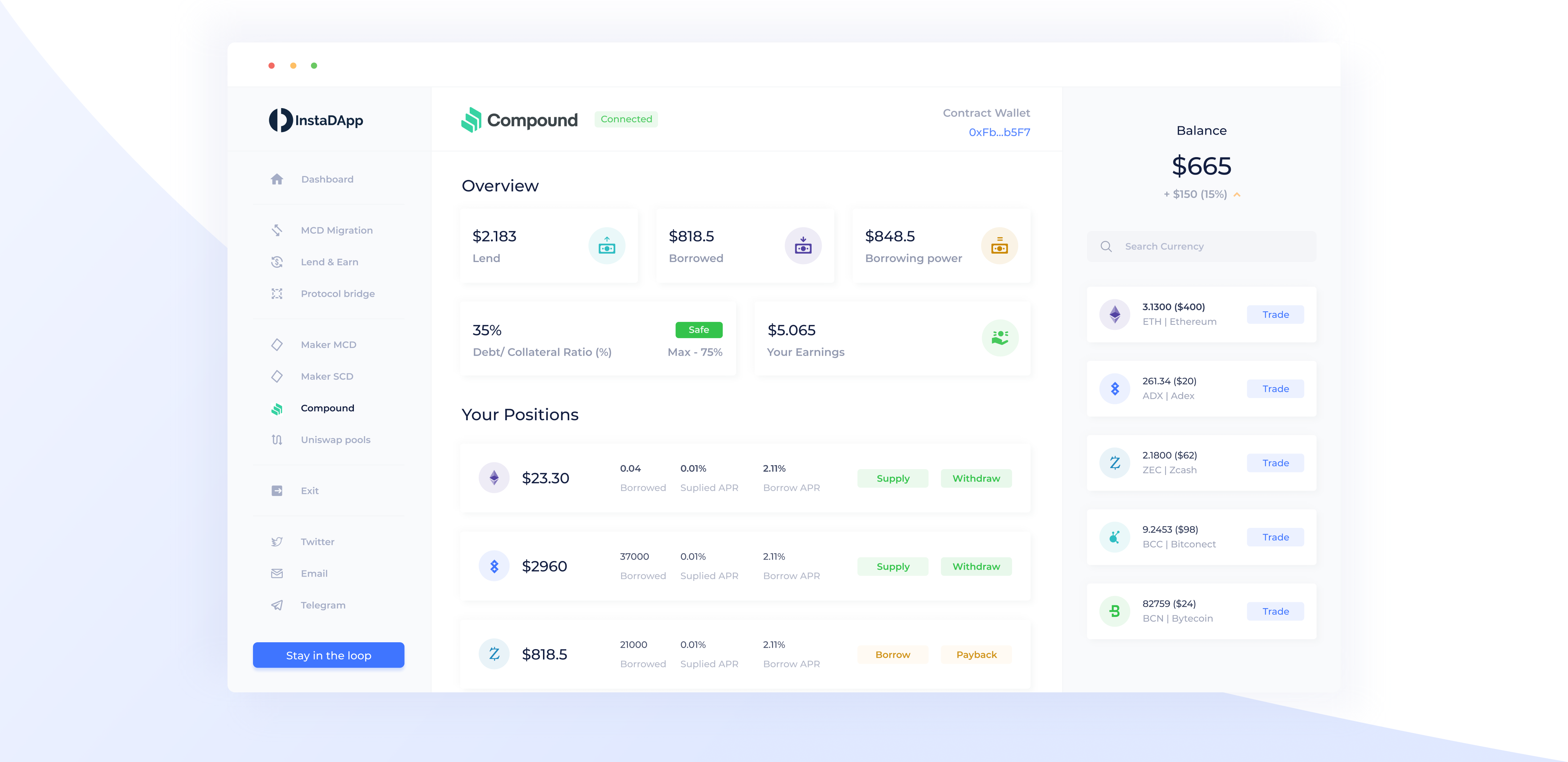
We’ve crafted the structure of the new dashboard design while having in mind our goal of simplifying the user's journey as much as possible. Therefore, we removed steps that created friction in order to create a platform that eases the task of trading and keeps track of your earnings.


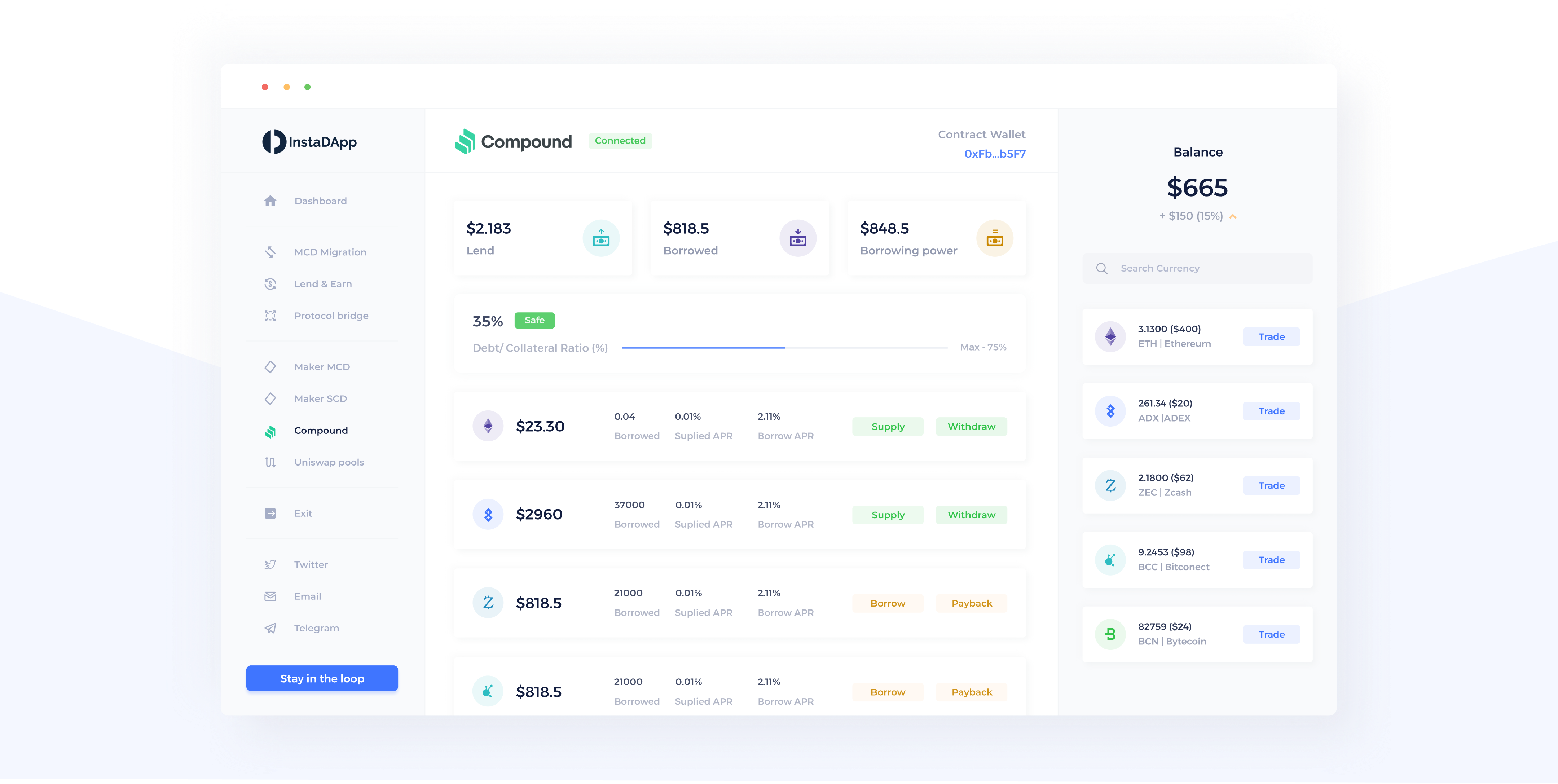
A first approach for a new Dashboard design
The result of our first design approach translates into a minimalistic dashboard that solves the usability issues of the past design. We’ve solved these by:
- Changing the position cards from a grid layout to a list approach that will allow the user to have bigger overall visibility without the need to scroll as much the interface allows to easily switch between buying and selling.
- A better spacing and hierarchy between the sidebar menu, the protocol section and the balance section, allowing for better separation of InstaDApp functions and other protocol specific functions.
- Using a very soft colour palette that makes the interface look organic and keeps the user focused on their task without much distraction.

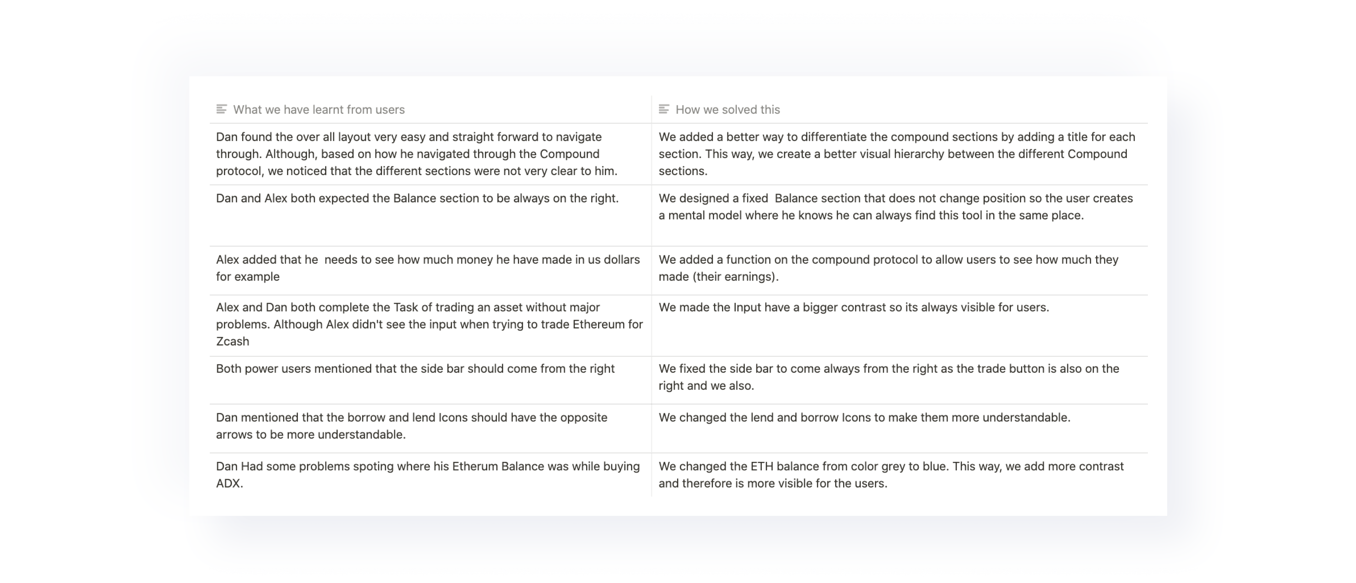
Time to test with users
Before achieving the final design result, we tested our first assumptions and design approach with targeted users. This provided us with the opportunity to validate our first hypothesis and gain new findings to iterate further.
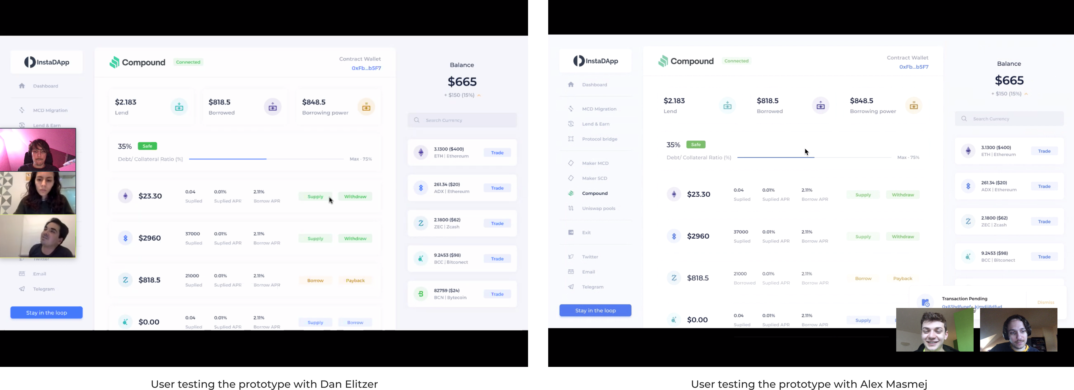

What's going to make our final design better?
Taking the findings we gained from the users and applying these to our initial design, allowed us to come up with a tailored design solution for power users.

Trading faster and better
Our second goal was to remove friction from the trading feature to allow users to perform their activities faster. We achieved this by:
- Replacing the buttons of buying and selling with just one button: Trade.
- The interface allows to easily switch between buying and selling.
- Having the ability to select and switch between tokens, makes it more intuitive for users to trade assets, not having to navigate back to the balance section each time.
- Fixing the sidebar to come always from the right makes the user flow much organic and intuitive.


Hover over left or right to see the changes
The final design
We brought to life a new InstaDApp dashboard that delights the user by its functionality ease and minimalistic look.
Same experience in mobile
Using a complex dApp like this shouldn't be much harder in mobile. That's why we tailored the same experience adapted to the mobile version.


Ready to talk?